Usability study · Ask AT&T
Docs AI. Making Compare and Draft Creation workflows click.
Ask AT&T added two new capabilities — comparing documents side-by-side, and turning that comparison into a shareable draft. Before wider rollout, I ran a moderated usability study to see whether people could actually find and use them.
13 participants across Compliance, External & Legislative Affairs, and Corporate Communications worked through both workflows while I watched for where the interface helped and where it got in the way.
- Role
- UX Researcher — study design, moderation, synthesis
- Participants
- 13, varying familiarity with AI tools and Ask AT&T
- Groups represented
- Compliance · External & Legislative Affairs · Corporate Communications
- Methods
- Moderated task-based usability testing · Think-aloud protocol
01 · Objective & participants
Evaluate pain points as people compare and draft.
The objective was narrow on purpose: evaluate and identify pain points and opportunities as users compare documents and create new drafts — the two newest capabilities in Ask AT&T.
Who we spoke to
13 participants with varying degrees of familiarity with AI tools and Ask AT&T, from:
Compliance
Ensuring adherence to all applicable laws, regulations, and internal policies by developing programs, conducting risk assessment, and promoting ethical business practices.
External & Legislative Affairs
Managing relationships with government entities, regulators, and stakeholders to influence policy, monitor legislative developments, and advocate for business interests.
Corporate Communications
Developing strategic communication plans to enhance AT&T’s reputation, manage media relations, and engage with employees, customers, and the public effectively.
02 · What we did: Compared docs
From a domain chat to a side-by-side diff.
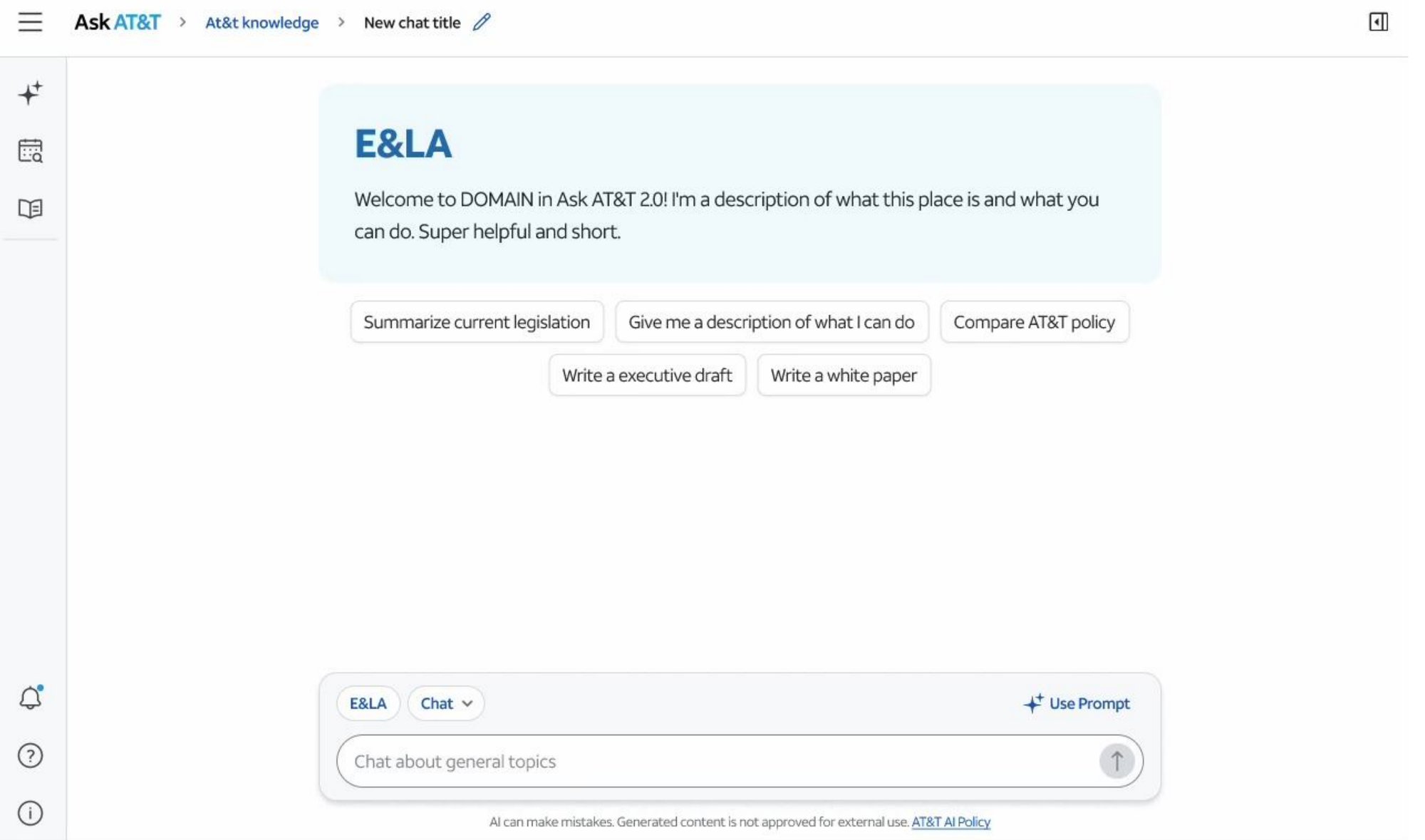
From a domain chat, users needed to select and compare 3 documents — switching into Compare mode, adding files, prompting the comparison, reading the result, and closing back out. Six tasks, watched one at a time.
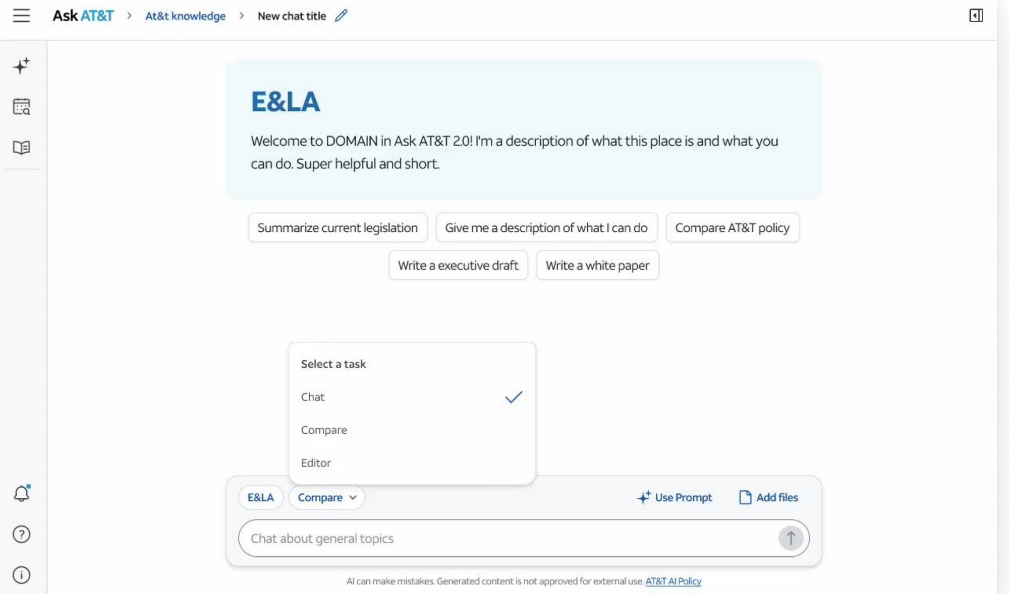
Switch to Compare Mode
Starting at the domain chat, users had to find the Workflow Selector and switch it from Chat into Compare.
“I didn’t realize that’s what the button was for. I thought I had to highlight something first.” — Communications strategist
Add & select files
Within Compare mode, users needed to select the documents they wanted and add them to the workflow.
“Yeah, that part is easy. I’ve done this in other tools.” — Corporate Communications lead
Submit a compare prompt
With files selected, users had to type a prompt to activate the comparison — nothing ran automatically.
“I thought it would just do something after I picked them.” — Communications strategist
“Oh, I’m supposed to write something here?” — Compliance policy advisor
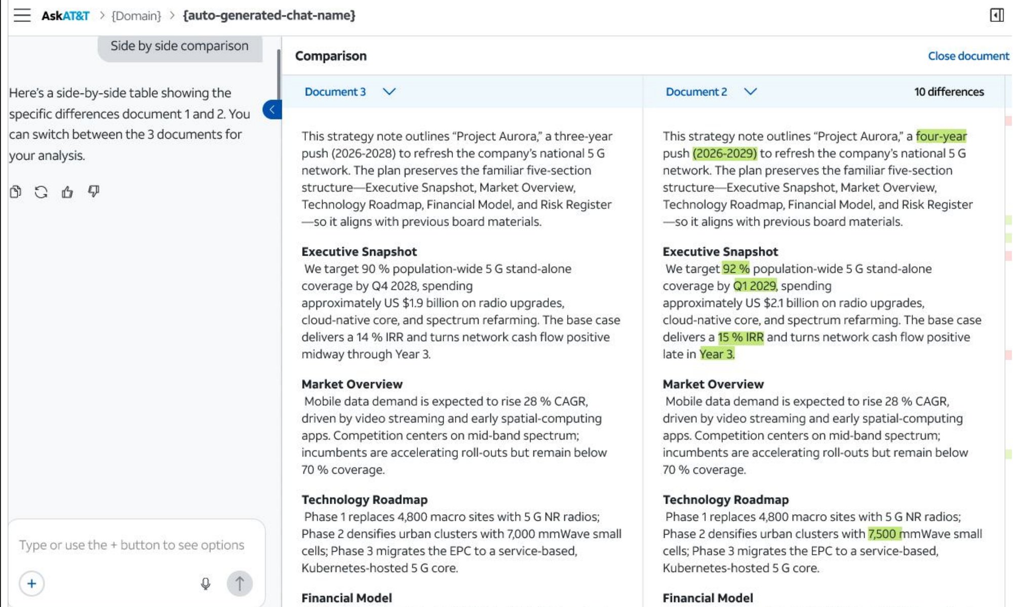
Read the side-by-side comparison
With a comparison summary visible, users selected the side-by-side comparison view to see differences highlighted.
“I saw that right away. I like that it gave me a next step.” — Compliance Program Manager
“The button is super clear. I knew exactly what it would do.” — Legislative Analyst
Use the Document Selector
Inside the comparison view, users needed to find and use the dropdown to swap Document 2 for Document 3.
“I didn’t realize I could click on that.” — PR & messaging specialist
“I kept trying to scroll over to see the last one.” — Employee communications lead
Close the comparison view
With the comparison complete, users were asked to close it and return to the original chat canvas.
“I didn’t need to think about it. It’s just where I’d expect the close button to be.” — Compliance policy advisor
Not an official task
We also watched what happened after users closed the comparison view, to gauge cognitive load. 11 of 13 could accurately describe what they’d just seen — the collapsed comparison window didn’t erase what they’d learned.
03 · What we did: Create drafts
Turning a comparison into a document.
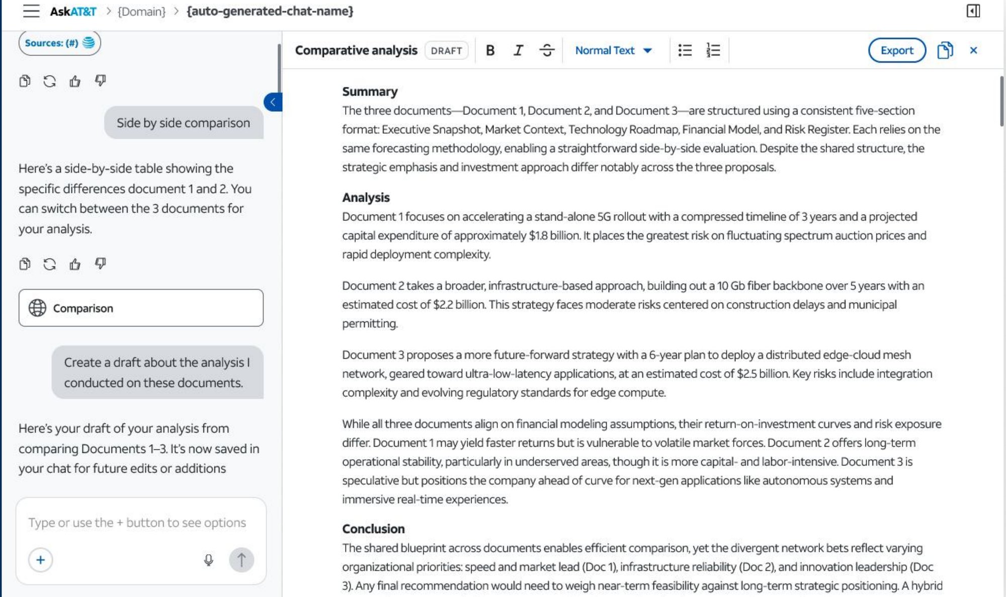
With the document comparison complete, we asked users to create a new draft describing their findings — switching into Editor mode, prompting a draft, formatting it, saving it, and closing back out. Five more tasks, building directly on what they’d just learned in Compare.
Switch to Editor workflow
To create a draft, users needed to select Editor mode from the same Workflow Selector used for Compare.
“I remember this from earlier. I just switch to Editor.” — Compliance training manager
“It’s the same place I went to for Compare, so I figured Editor would be here, too.” — PR & messaging specialist
Submit a draft prompt
Users typed a prompt asking the assistant to draft a write-up of the comparison they’d just run.
“I just typed the prompt like I did before — it works the same way.” — Corporate Communications lead
“So it’s like the Compare thing. I type it in here.” — Compliance policy advisor
Apply formatting
With a draft generated, users needed to find the type-formatting dropdown to change font case and styling.
“Oh yep — there’s the formatting bar, just like in Word.” — Policy communications lead
“I figured it would be up here with the text tools. Easy to find.” — Legislative compliance analyst
Save the draft
Users were asked to save their draft — the control for this was labeled “Export,” not “Save.”
“Export? Okay, yeah — I figured that meant save.” — Compliance training manager
“I was looking for a save button, but this makes sense up here.” — Employee communications lead
Close Editor mode
With the draft saved, users closed the Editor window to return to the main canvas.
“Makes sense, same as closing anything else.” — Corporate communications lead
“I hesitated for a second, but then I saw the X.” — Policy oversight specialist
04 · What worked & what didn’t
Patterns, pain points, and moments of clarity.
What worked
Positive reception to new functionalities
Users praised side-by-side comparison (100% initiation success) and appreciated the structure and usefulness of AI-generated drafts.
Familiar patterns drove task success
82–92% of users easily completed formatting, saving, selecting, and closing actions using standard UI conventions.
Learnability across workflows
70% of users who had seen Compare Mode successfully applied that knowledge to enter Editor Mode in the Workflow Selector and submit a prompt.
What needs work
New users struggled to initiate workflows
70% had difficulty finding the Workflow Selector, and 54% didn’t realize they needed to type a prompt — unclear entry points, no instructional cues.
Document Selector went unnoticed
100% of users failed to switch to the third document — many expected to scroll horizontally or see all docs side-by-side.
Label clarity caused hesitation
30% of users hesitated interpreting terms like “Editor” and “Export,” unsure of their function.
05 · Strategic implications
The system is learnable. Labels and discoverability aren’t optional.
Familiar UI patterns drive success
Users reapply learned behaviors, suggesting strong foundational design.
Terminology matters
Labels like “Editor” and “Export” caused minor friction despite successful outcomes.
Prompt-based interactions need scaffolding
Without clear CTAs, users hesitate — impacting fluidity and adoption.
Expectations from other tools shaped behavior
Users bring SharePoint, Word, and Teams mental models into Ask AT&T.
06 · Tactical recommendations
Three fixes to support the interactions that matter most.
01
Help users enter Compare and Editor modes
- Improve visual affordance of the Workflow Selector: stronger contrast, labeling (e.g. “Choose Workflow”), or iconography to signal interactivity.
- Add a brief tooltip or onboarding nudge: first-time users could be guided with a line like “Start by choosing Compare or Editor Mode above.”
02
Guide users to submit a prompt
- Use placeholder text in the input field: e.g. “Type what you want to compare…” or “Ask me to summarize these documents.”
- Provide a one-time hint or helper text after file selection, prompting the next action.
03
Make document switching more discoverable
- Redesign the document selector dropdown: style it like a tab or button group, rather than a flat label, to suggest interactivity.
- Add visual cues or instructional text: e.g. “Select which two documents to compare” above or beside the selector.